

Stop Making These 5 Fatal Interactive Design Mistakes That Kill User Engagement (2026 Edition)
- Owen Measures

- Dec 31, 2025
- 5 min read
User engagement is the lifeblood of any successful website. Yet, as we move deeper into 2026, countless businesses continue making the same devastating interactive design mistakes that send visitors running for the exit. These aren't minor oversights: they're conversion killers that can destroy months of marketing investment in seconds.
The digital landscape has evolved rapidly. Users have become more demanding, attention spans have shortened further, and Google's algorithms increasingly prioritise user experience signals. What worked in 2022 or even 2024 simply doesn't cut it anymore.
After analysing hundreds of websites and studying user behaviour patterns throughout 2025, we've identified five critical mistakes that are still plaguing websites across industries. More importantly, we'll show you exactly how to fix them before they cost you another customer.
Mistake #1: Confusing Navigation That Leaves Users Lost
Your navigation is your website's roadmap. When it's confusing, users feel lost before they even understand what you offer. Yet countless websites still prioritise creativity over clarity, burying essential information behind cryptic menu labels and overly complex hierarchies.
The Problem: Many businesses use industry jargon in their navigation, create dropdown menus with too many options, or hide critical pages like pricing or contact information. If visitors can't find what they're looking for within seconds, they leave. It's that simple.
What This Costs You: Poor navigation doesn't just frustrate users: it signals to search engines that your site provides a poor user experience, directly impacting your SEO rankings.

The 2026 Solution:
Keep main navigation to 5-7 clear labels maximum
Use language your customers use, not internal company terms
Place your most important pages (services, contact, pricing) in primary navigation
Implement a logical hierarchy where subpages are genuinely related to parent pages
Test your navigation with real users: if they hesitate, simplify further
Quick Fix: Replace vague labels like "Solutions" or "Offerings" with specific terms like "Web Design Services" or "SEO Packages." Your users will thank you with longer sessions and higher conversion rates.
Mistake #2: Weak Call-to-Action Buttons That Fail to Convert
Call-to-action buttons are the bridge between user interest and business conversion. Yet many websites still use generic, uninspiring CTAs that blend into the background noise of modern web browsing.
The Problem: Generic phrases like "Learn More," "Click Here," or "Submit" tell users nothing about what happens next. Poor visual design makes buttons easy to miss, while weak placement means they appear when users aren't ready to act.
What This Costs You: Weak CTAs directly translate to lower conversion rates. A button that converts at 2% instead of 5% can mean the difference between business growth and stagnation.

The 2026 Solution:
Use action-oriented, specific language: "Get Your Free Website Audit" instead of "Learn More"
Create visual contrast: your CTA should be the most prominent element on the page
Place buttons strategically: after you've built value, not randomly throughout content
Test different colours, sizes, and copy to optimise performance
Ensure mobile buttons are large enough for touch interaction (minimum 44px)
Advanced Tip: Consider the user's mindset at different page sections. Early visitors might respond to "Explore Our Portfolio," while those who've read your entire service page are ready for "Start Your Project Today."
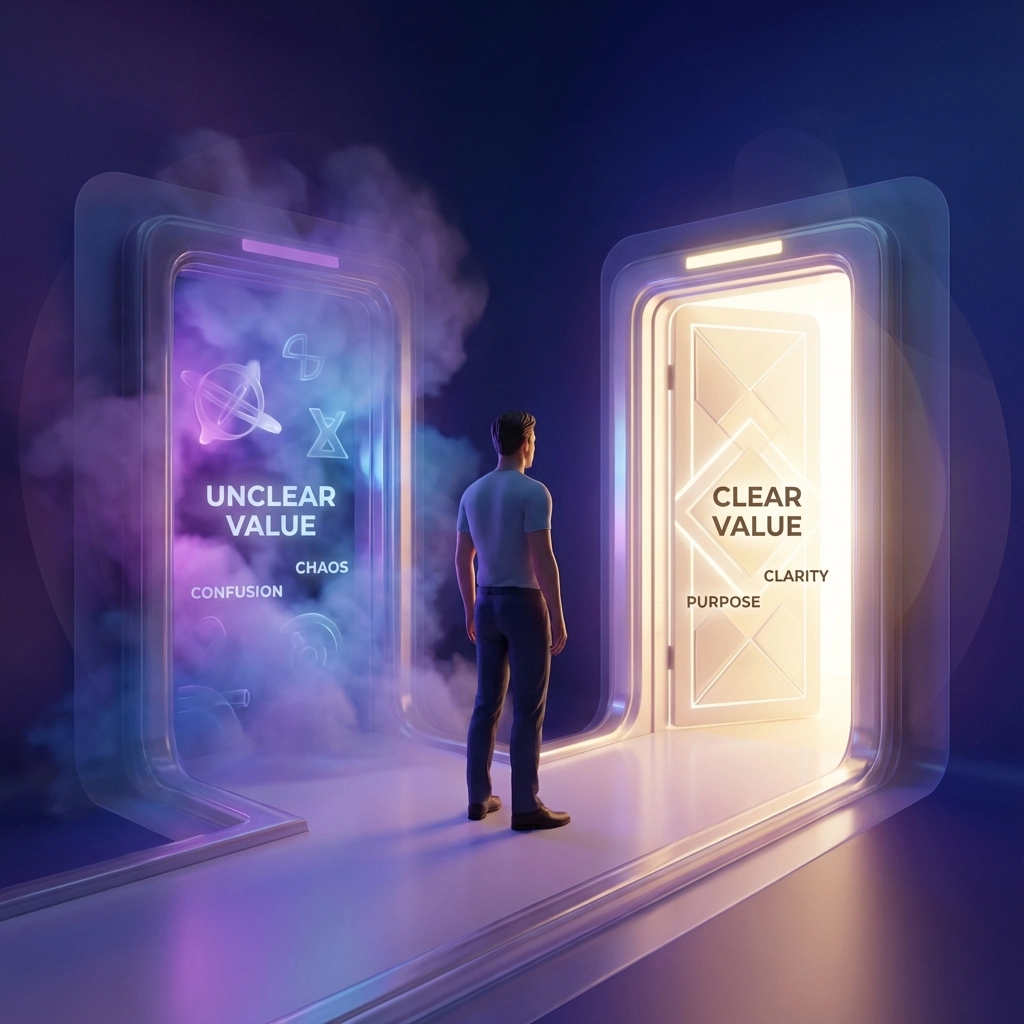
Mistake #3: Unclear Value Propositions That Confuse Rather Than Convert
In 2026, users expect to understand what you offer and why it matters within five seconds of landing on your site. Many businesses still fail this fundamental test, leaving visitors confused about their core offering.
The Problem: Websites often focus on features instead of benefits, use industry jargon that confuses non-experts, or bury their value proposition beneath paragraphs of unnecessary text. When users can't quickly grasp what makes you different, they move on to competitors who communicate more clearly.
What This Costs You: An unclear value proposition wastes every marketing pound you spend driving traffic to your site. Visitors leave before engaging because they simply don't understand how you can help them.
The 2026 Solution:
Lead with benefits, not features: "We help small businesses attract more customers online" vs "We offer responsive web development services"
Use your homepage headline to clearly state what you do and for whom
Structure content for scanning: use headers, bullet points, and short paragraphs
Place your strongest value statement above the fold where everyone sees it
Include social proof near your value proposition to reinforce credibility
Pro Tip: Test your value proposition by showing your homepage to someone unfamiliar with your business for 5 seconds. If they can't explain what you do, it needs work.
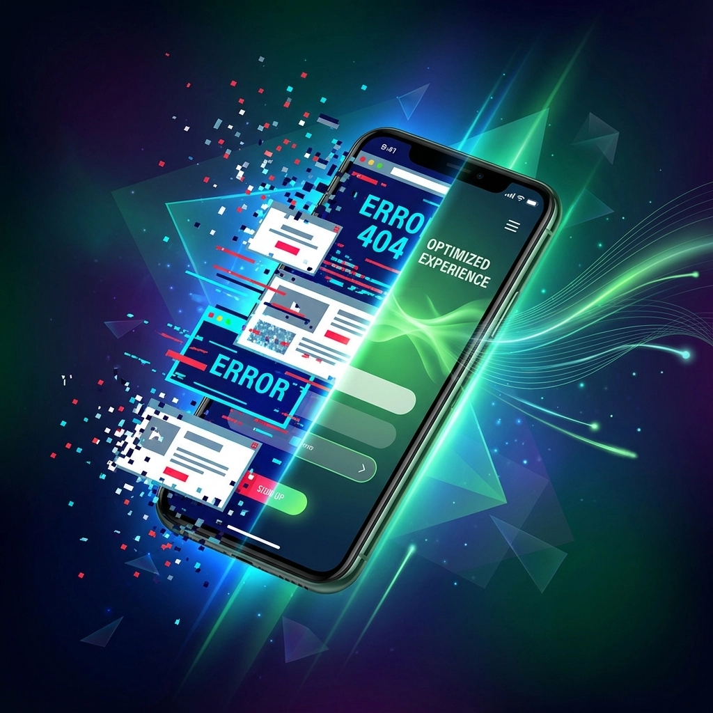
Mistake #4: Poor Mobile Optimisation in a Mobile-First World
With over 60% of web traffic coming from mobile devices in 2026, poor mobile optimisation isn't just a mistake: it's business suicide. Yet many websites still treat mobile as an afterthought rather than the primary user experience.
The Problem: Non-responsive layouts, tiny text, buttons placed too close together, slow loading times, and forms that are impossible to complete on small screens. Google's mobile-first indexing means these issues directly impact your search rankings.
What This Costs You: Google reports that 53% of mobile users abandon sites that take longer than 3 seconds to load. Poor mobile experience doesn't just lose immediate visitors: it damages your long-term search visibility.
The 2026 Solution:
Implement responsive design that adapts to all screen sizes
Use fonts that are easily readable on small screens (minimum 16px)
Make touch targets at least 44px for comfortable tapping
Optimise images and code for fast loading on mobile networks
Simplify mobile navigation with clear, thumb-friendly menus
Test your site on actual devices, not just desktop browser simulators
Critical Check: Use Google's Mobile-Friendly Test tool and PageSpeed Insights to identify specific issues. Address Core Web Vitals metrics, as these directly impact both user experience and search rankings.
Mistake #5: Visual Overload That Overwhelms Users
Modern websites often suffer from visual chaos: too many elements competing for attention, poor colour choices, and layouts that assault users rather than guide them. This creates cognitive overload that drives visitors away.
The Problem: Websites pack too much information above the fold, use clashing colours, implement distracting animations, or create layouts without clear visual hierarchy. Users feel overwhelmed and can't focus on your key messages.
What This Costs You: Visual overload increases bounce rates and reduces time spent on site. When users can't process your content easily, they leave for simpler, cleaner alternatives.
The 2026 Solution:
Embrace white space: it's not wasted space, it's breathing room for your content
Use a limited colour palette that supports your brand and improves readability
Create clear visual hierarchy with size, contrast, and spacing
Limit the number of elements above the fold to essential information only
Choose fonts that enhance readability rather than just looking creative
Ensure animations serve a purpose rather than just showing off technical capabilities
Design Principle: Follow the "one thing per page" rule. Each page should have one primary goal and everything should support that objective.
The Path Forward: Better Design, Better Business
These five mistakes might seem straightforward, but they're remarkably persistent across the web. The businesses that eliminate them consistently outperform those that don't: not just in user engagement, but in search rankings, conversion rates, and ultimately, revenue.
The good news? These issues are entirely fixable. Most require strategic thinking rather than major technical overhauls. Start with the mistake that's easiest to address in your situation, measure the impact, then move to the next.
Remember: in 2026's competitive digital landscape, user experience isn't just nice to have: it's your competitive advantage. The websites that prioritise clear navigation, compelling CTAs, obvious value propositions, mobile optimisation, and clean design will dominate their markets.
Your users are waiting for a better experience. The only question is whether you'll give it to them before your competitors do.
Ready to transform your website's user engagement? Contact WebOws Design to discuss how we can help eliminate these costly mistakes from your digital presence.
Comments