

Mobile eCommerce Website Design Tips for 2026: How to Boost Sales with User-Friendly Features
- Owen Measures

- Dec 20, 2025
- 5 min read
Let's be honest, if your eCommerce site isn't mobile-optimized by now, you're losing money every single day. With over 80% of customers shopping on their phones and 40% bouncing after a poor mobile experience, the stakes have never been higher.
But here's the thing: 2026 isn't just about having a mobile-responsive site anymore. It's about creating user-friendly experiences that feel native to how people actually shop today. Whether you're using Wix Studio or diving deep into custom development, these strategies will transform your mobile eCommerce game.
Start with Mobile-First Architecture (Not Mobile-Last)
Most businesses still design for desktop first, then try to squeeze everything onto a phone screen. That's backwards thinking that kills conversions.
True mobile-first design means starting with the smallest screen and building up. This forces you to prioritize what really matters, clear product images, simple navigation, and fast checkout flows. When you design this way, your site naturally becomes faster and more focused.
The bonus? Google's mobile-first indexing means this approach directly boosts your SEO rankings. Sites built mobile-first typically load 30-50% faster than their desktop-first counterparts, which translates to better search visibility and higher conversion rates.

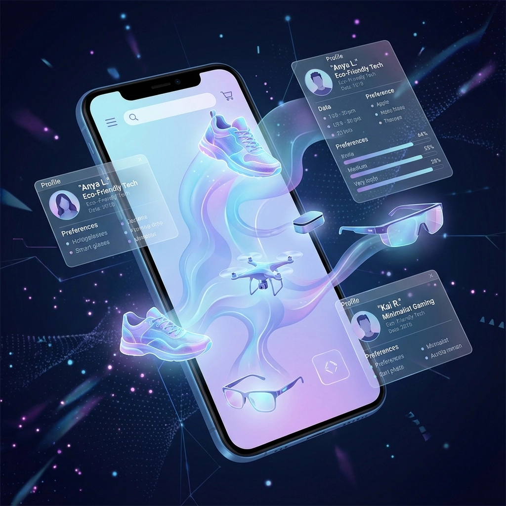
Personalization That Actually Works in Real-Time
Generic product pages are dead. Today's shoppers expect websites to remember them and adapt instantly to their behavior.
Think beyond "Hi [First Name]" emails. Real personalization means showing different product recommendations, adjusting your homepage layout, and even changing your navigation based on how someone shops. If a customer always buys athletic wear, why show them formal shoes first?
Amazon mastered this years ago: their entire homepage shifts based on your browsing history. In 2026, this level of adaptive UX is table stakes for any serious eCommerce site. The technology is more accessible than ever, especially with modern platforms like Wix Studio that make AI-driven personalization achievable for smaller businesses.
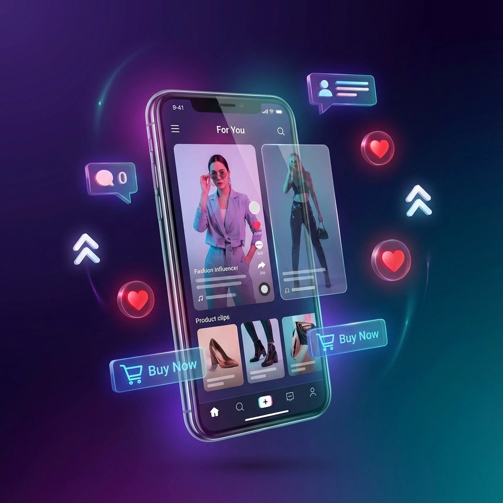
Design for How People Actually Shop (Swipes, Voice, AR)
Your customers aren't just clicking anymore. They're swiping through products like Instagram stories, using voice search to find items, and expecting AR try-on features.
Design for vertical video product galleries that feel like TikTok. Create swipe-based navigation that mimics social media browsing. Support voice search optimization so people can find your products by speaking naturally.
This multimodal approach isn't just trendy: it's practical. When someone can swipe through your product gallery with the same gesture they use on social media, the shopping experience feels effortless.
Social Commerce Integration Done Right
Stop treating social media and your website as separate entities. The best mobile eCommerce sites blur these lines completely.
Embed vertical videos that recreate the discovery moment customers had on TikTok or Instagram. Create "Shop the Look" galleries that let people buy entire outfits from a single creator post. Support in-app checkout so customers never have to leave their social environment.
This isn't about adding social media buttons to your product pages: it's about reimagining your entire site to match how people discover and buy products in 2026.
Microinteractions That Guide Without Overwhelming
Every tap, scroll, and hover should feel responsive. These tiny animations and feedback elements aren't decoration: they're essential UX signals that build trust and guide behavior.
Think about buttons that slightly expand when touched, progress indicators that animate during checkout, or subtle product image zooms that respond to finger pressure. These microinteractions make your site feel alive and responsive rather than static and clunky.
The key is restraint. Great microinteractions enhance usability without drawing attention to themselves. Users should feel the polish without being distracted by it.
Performance as a Design Principle
Speed isn't a technical afterthought: it's a core design constraint that should influence every creative decision you make.
Heavy animations might look cool on desktop, but if they slow down your mobile site, they're hurting sales. Large hero images might be striking, but if they delay your product listings from loading, customers will bounce.
Design with performance budgets from day one. Every element should justify its impact on loading speed. This constraint actually leads to cleaner, more focused designs that convert better.
At WebOws Design, we've seen conversion rates jump 15-20% when clients prioritize performance alongside aesthetics in their responsive website layout decisions.
Navigation That Gets Out of the Way
Mobile shoppers want to find products fast and buy them faster. Complex navigation structures that work on desktop become conversion killers on small screens.
Implement prominent search functionality with smart autocomplete. Use clear category filters that customers can apply with single taps. Create quick-view modals so people can see product details without full page loads.
Your navigation should be invisible when it's working well: customers should reach their desired products without thinking about the path they took.
Rich Media That Builds Confidence
Pictures tell stories, but videos close deals. In 2026, embedded video on product pages isn't optional: it's expected.
Show products in motion. Let customers see fabric texture, watch how jewelry catches light, or understand the actual size of furniture in real rooms. This visual richness addresses the biggest barrier to online shopping: the inability to touch and examine products physically.
Support diagonal scrolling effects and scroll-triggered animations to keep content engaging without sacrificing performance. The goal is creating confidence through immersion.
Organic Design Elements That Feel Human
After years of rigid grids and stark minimalism, design is getting softer and more approachable. This isn't just aesthetic: it's psychological.
Incorporate subtle organic shapes, flowing lines, and soft gradients that make digital experiences feel more natural. Use sculptural typography and dynamic layering to create visual interest without overwhelming the interface.
This humanization of design reflects what overwhelmed shoppers actually want: technology that feels warm and accessible rather than cold and algorithmic.

Accessibility as Competitive Advantage
Inclusive design isn't just the right thing to do: it's smart business. When your site works seamlessly for users with disabilities, it works better for everyone.
Ensure strong color contrast that works in bright sunlight. Support keyboard navigation for customers who can't use touchscreens. Provide alt text for images that screen readers can parse.
These considerations expand your customer base while improving the overall user experience. Accessible sites consistently show higher conversion rates across all user segments.
Branding Design That Works at Any Size
Your logo and visual identity need to be instantly recognizable whether someone sees them on a billboard or a phone screen. This requires rethinking traditional branding approaches.
Design logos that remain clear at 16x16 pixels. Choose typography that's readable without zooming. Select color palettes that work across different screen technologies and lighting conditions.
Strong mobile branding isn't about shrinking your desktop identity: it's about creating a cohesive visual system that adapts fluidly to any context.

The WebOws Design Approach
At WebOws Design, we leverage both Wix Studio and Wix Editor to create modern website designs that excel on mobile. Our approach combines the flexibility of custom development with the reliability of proven platforms.
Whether you're building a new eCommerce site or optimizing an existing one, we focus on user-friendly websites that drive actual business results. Our digital marketing services ensure your optimized site reaches the right customers at the right moments.
Ready to transform your mobile eCommerce experience? Get in touch and let's discuss how these 2026 strategies can boost your sales.
Summary
Mobile eCommerce success in 2026 demands more than responsive design: it requires rethinking how customers discover, evaluate, and purchase products. Focus on mobile-first architecture, real-time personalization, multimodal interactions, and performance-driven design decisions. Integrate social commerce naturally, use subtle microinteractions, and prioritize accessibility throughout. When these elements work together, you create user-friendly experiences that convert browsers into buyers.
Comments